Netta
PT-BR.
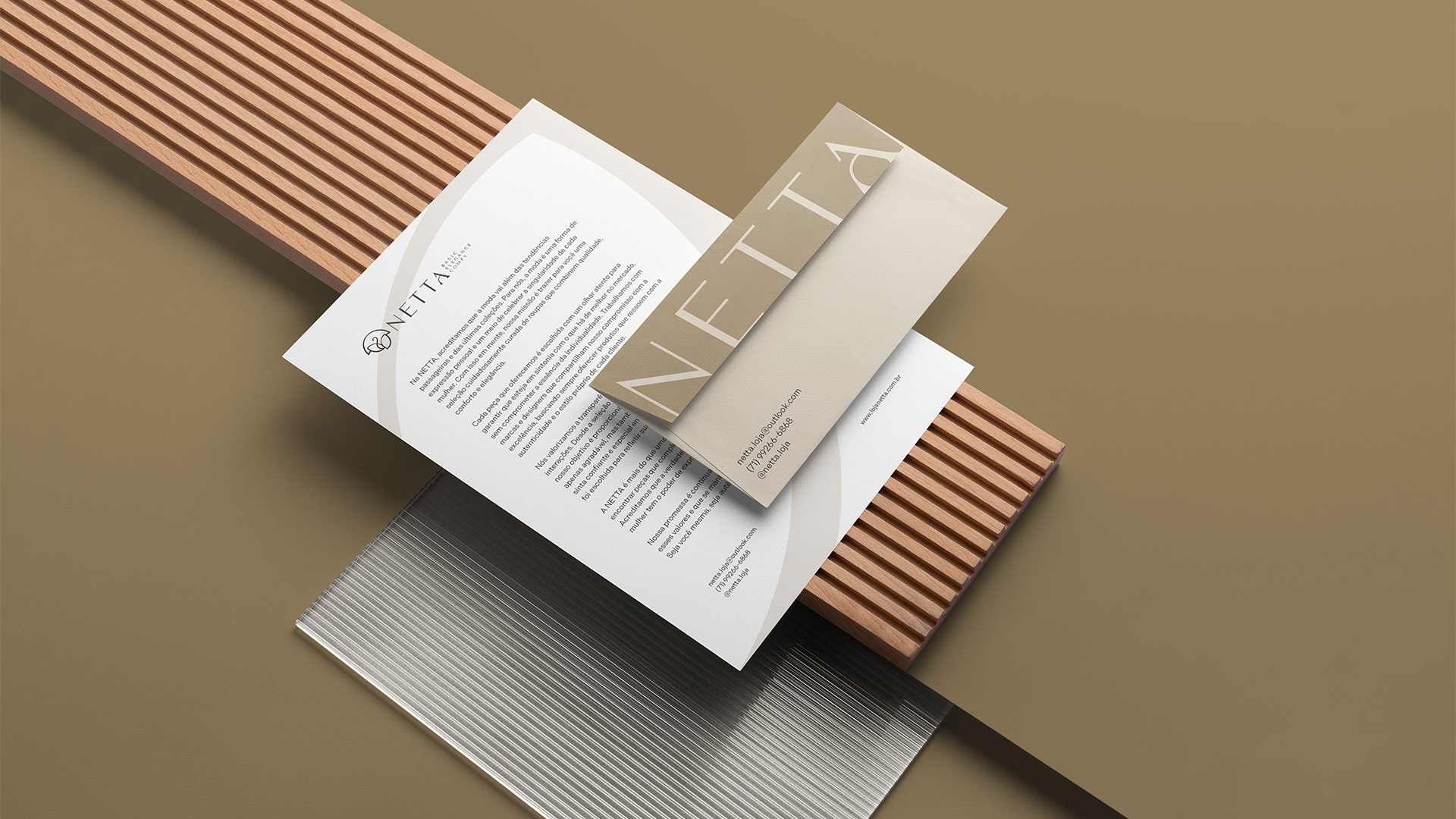
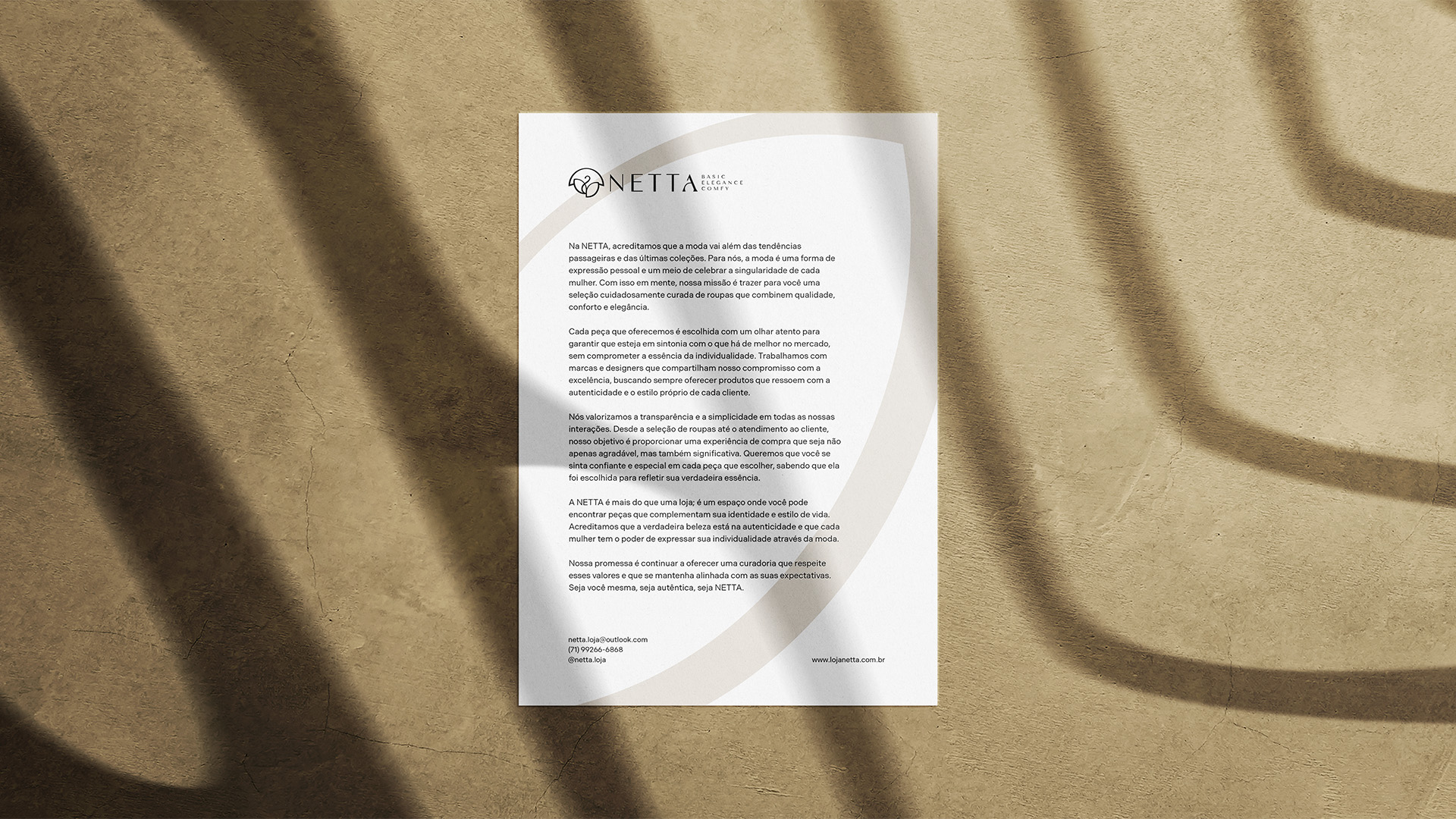
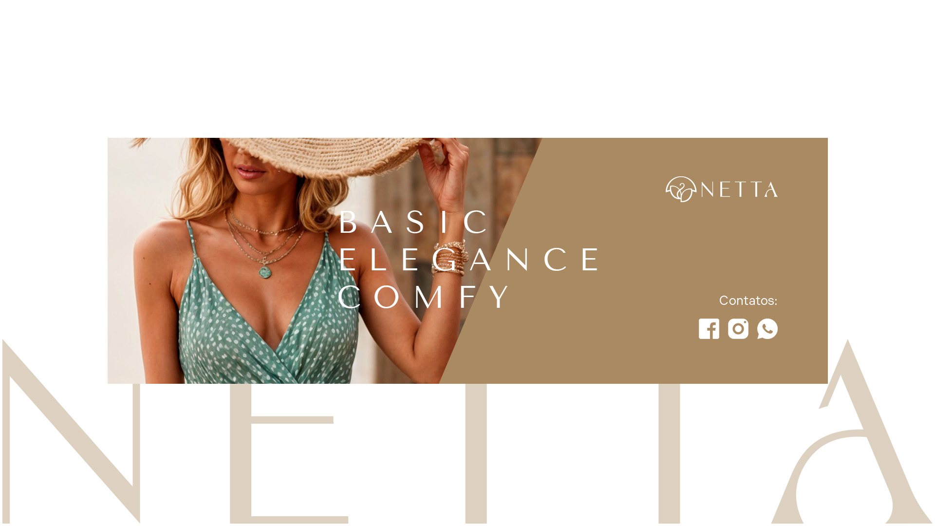
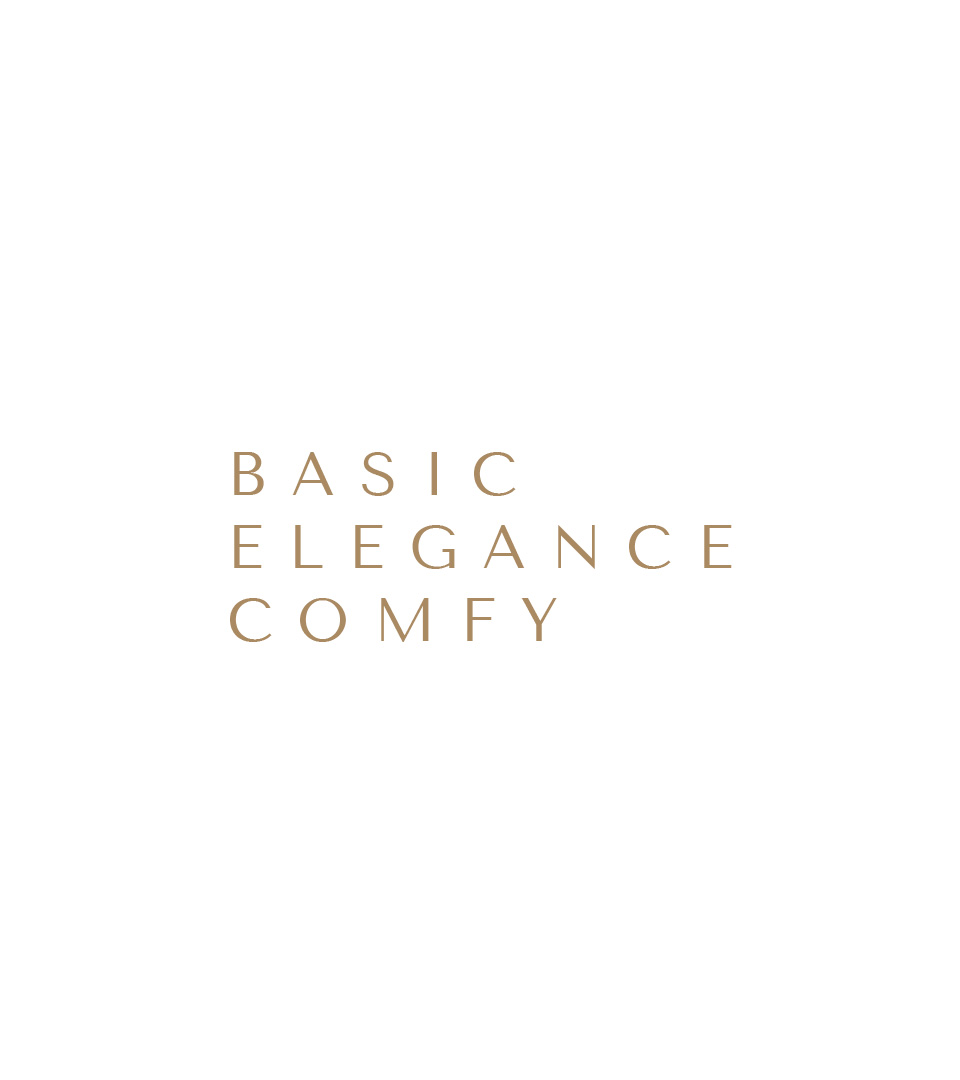
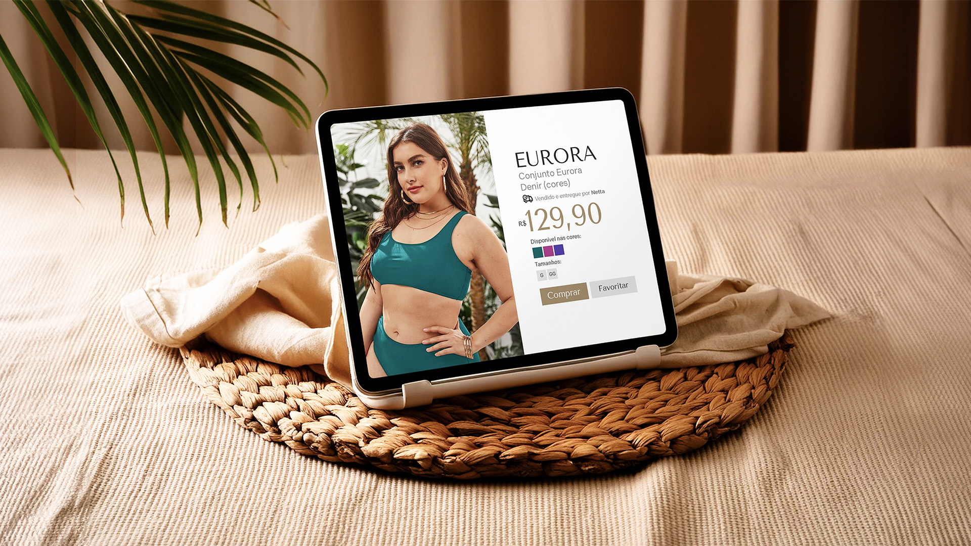
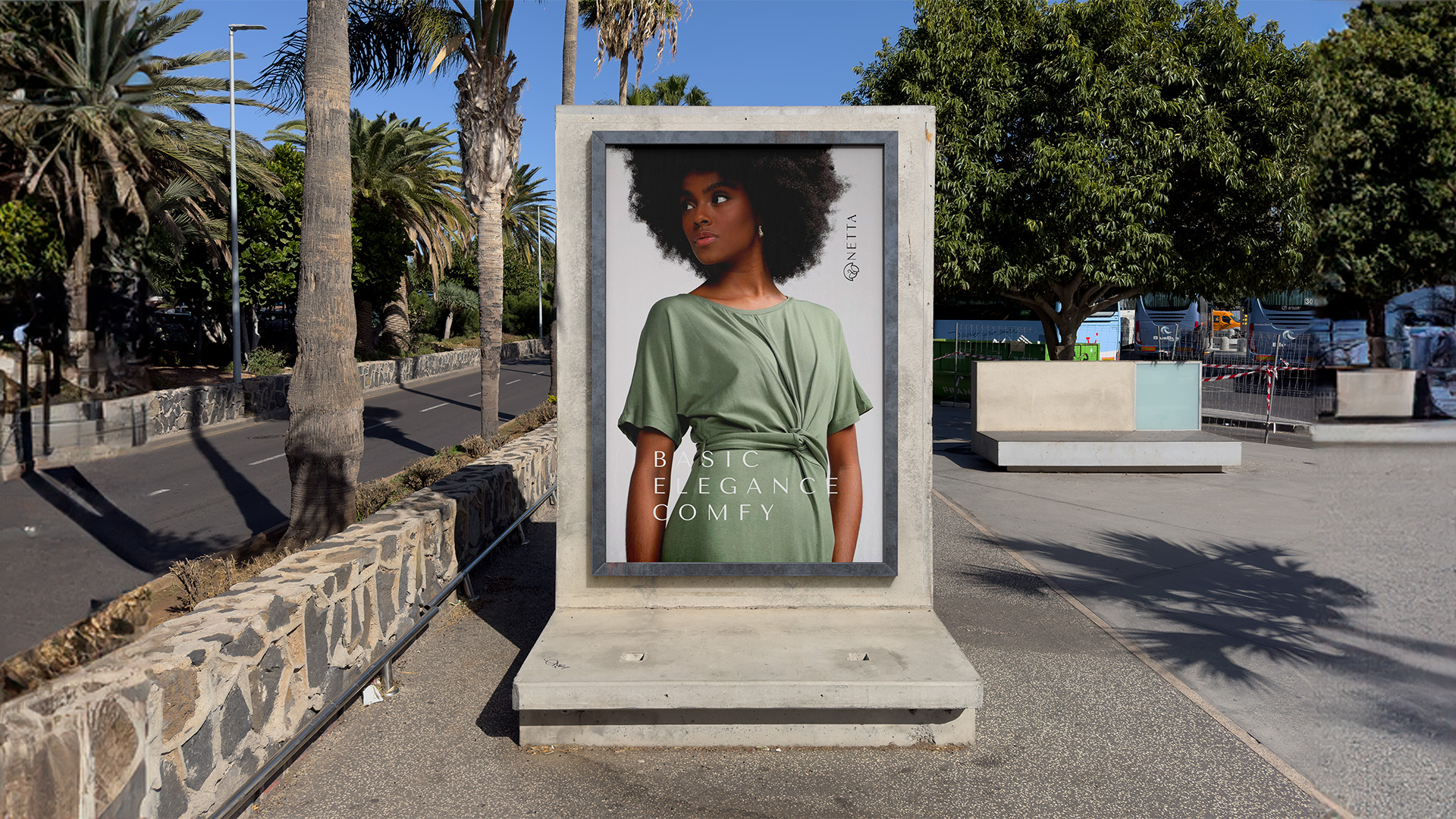
Netta é uma marca de roupas femininas que nasce com a proposta de valorizar a individualidade da mulher através de peças essenciais, elegantes e atemporais. O projeto foi construído com base em atributos como qualidade, conforto, simplicidade e autenticidade, oferecendo uma experiência que vai além do vestir.
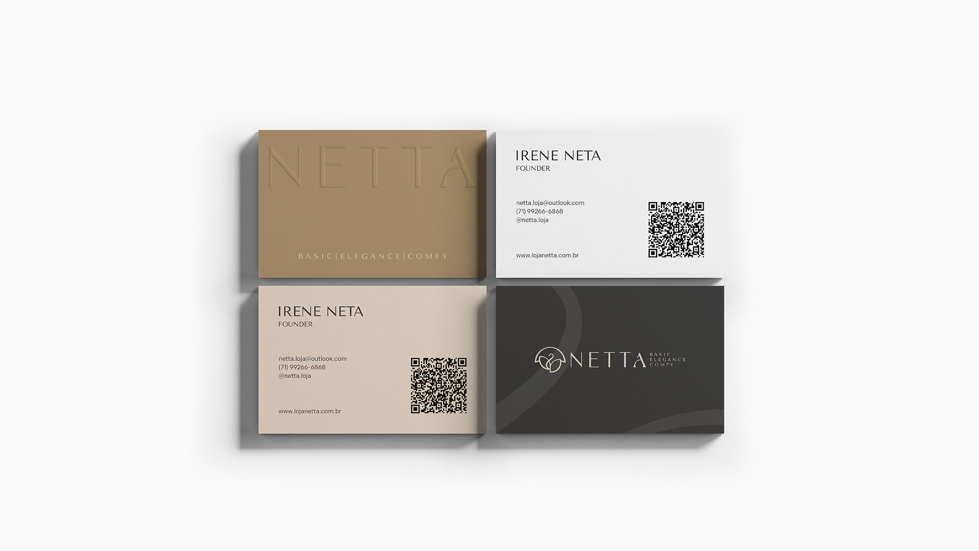
A marca carrega um significado pessoal: o nome “Netta” é uma homenagem à avó da fundadora — uma mulher forte e íntegra. Esse vínculo afetivo se reflete na essência da marca, que respeita as histórias, as fases e os movimentos de cada mulher.
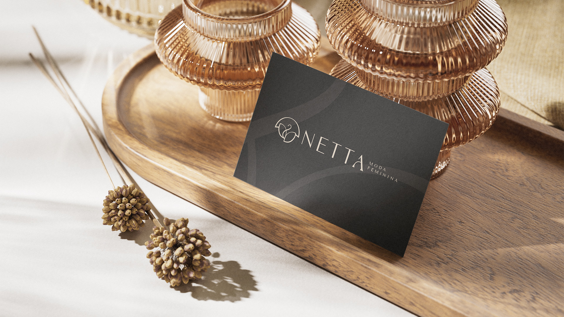
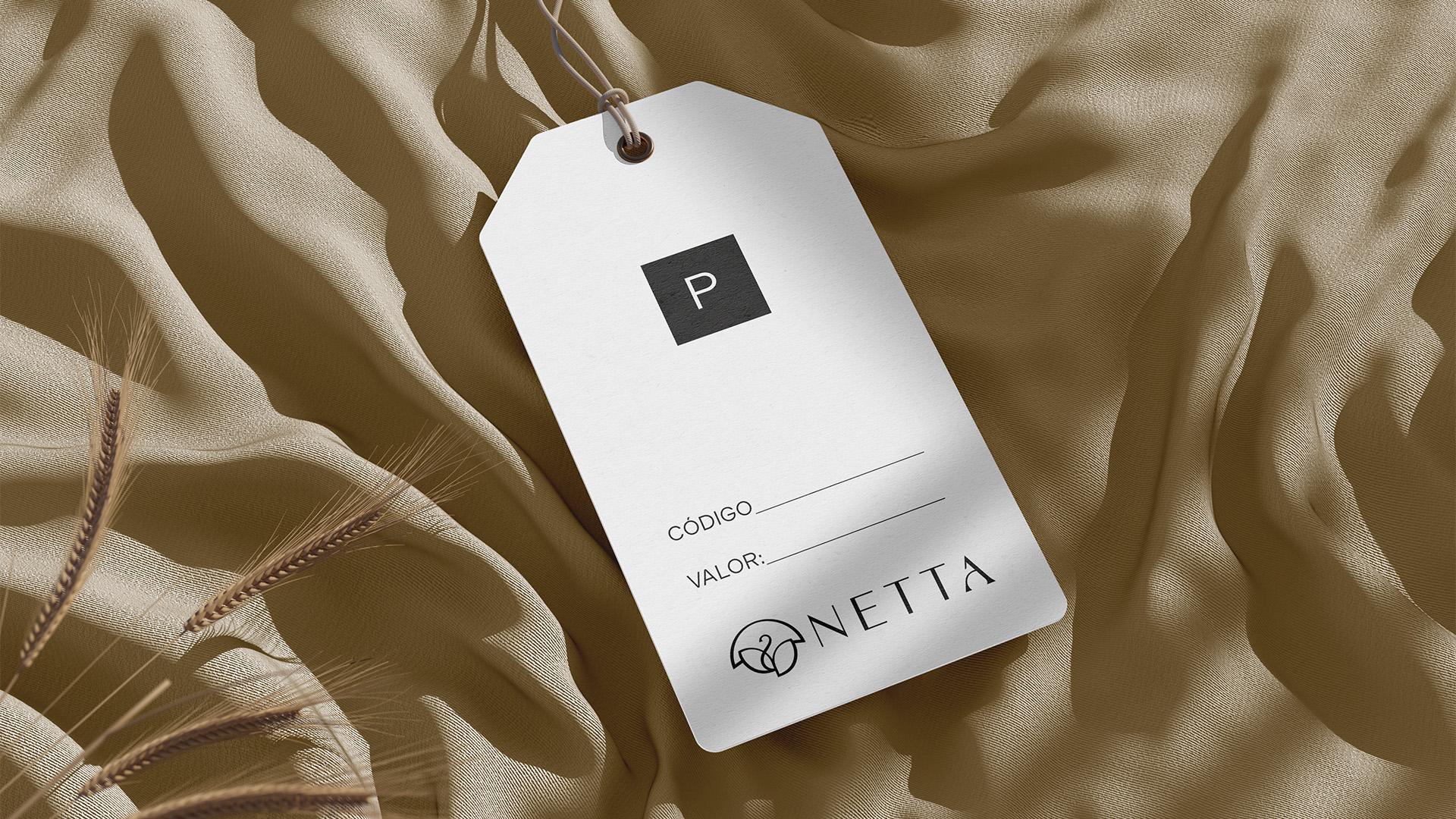
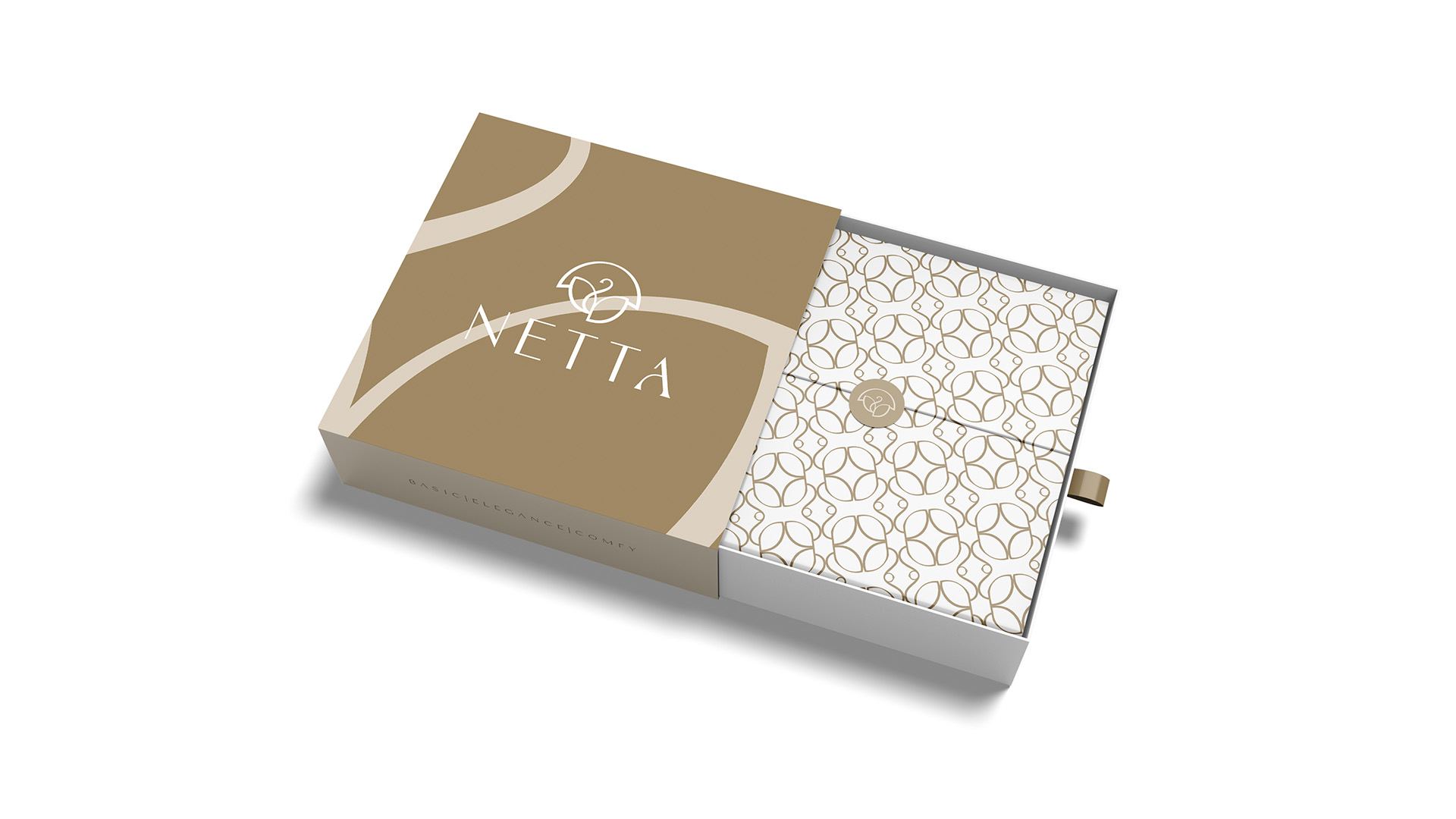
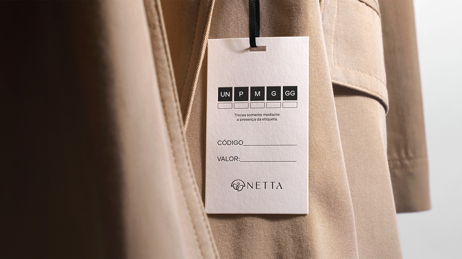
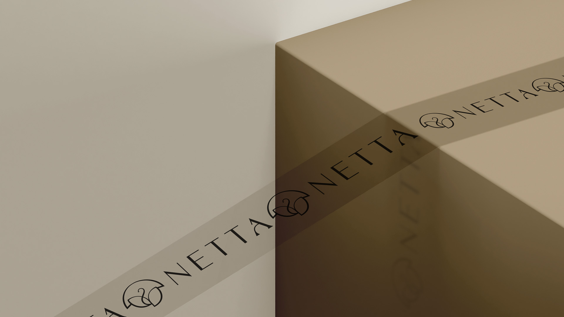
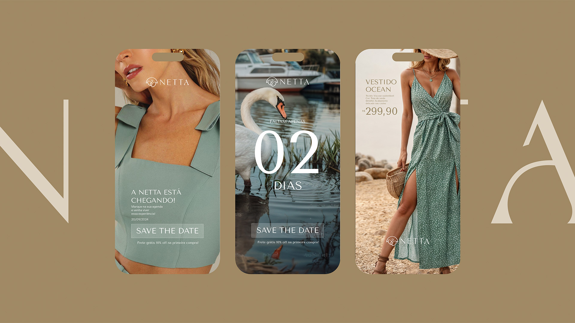
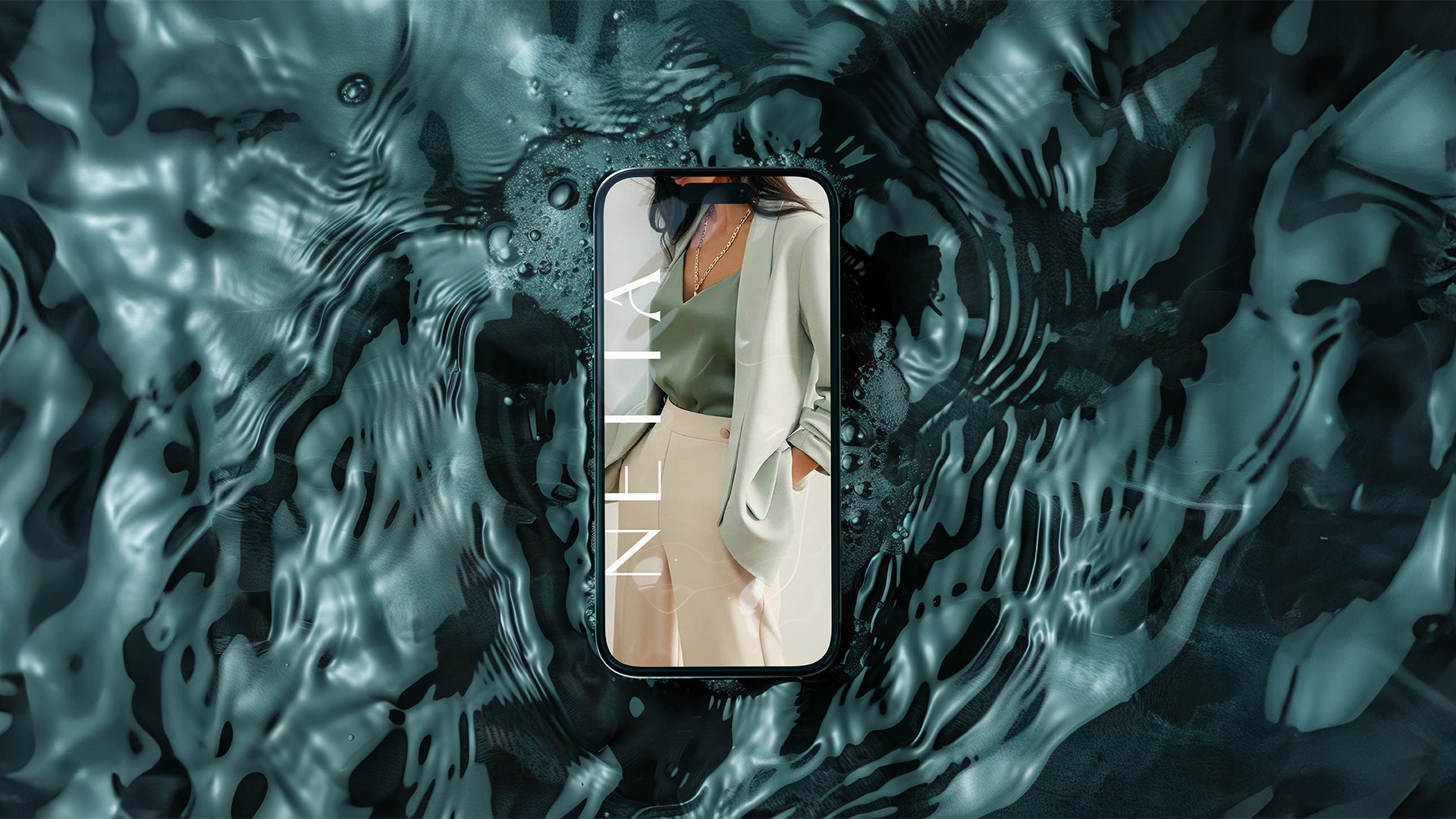
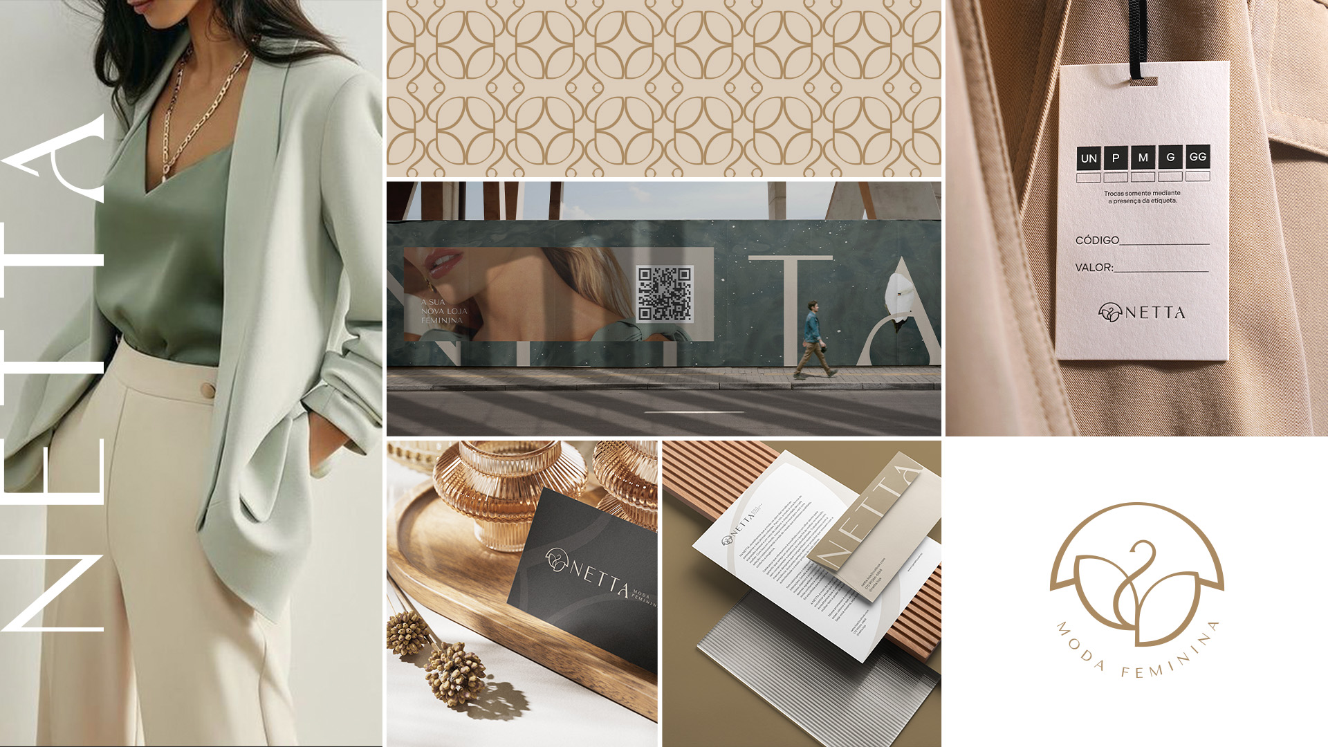
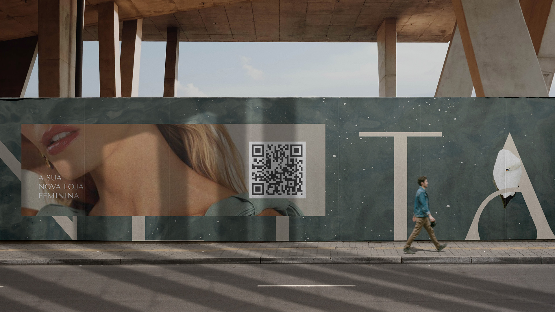
A identidade visual foi desenvolvida para comunicar sofisticação de forma acessível. A tipografia em caixa alta, com ajustes sutis, reforça a elegância e o cuidado nos detalhes. O símbolo reúne três elementos: cisne, lua e flor, que, juntos, representam transformação, feminilidade e delicadeza — conectando o universo emocional da marca ao seu propósito comercial.
EN.
Netta is a women’s clothing brand born with the purpose of celebrating each woman’s individuality through essential, elegant, and timeless pieces. The project was built on values such as quality, comfort, simplicity, and authenticity — offering an experience that goes beyond clothing.
The brand carries a personal meaning: the name “Netta” is a tribute to the founder’s grandmother — a strong and honorable woman. This emotional connection is reflected in the brand’s essence, which honors the stories, phases, and transitions of every woman. The visual identity was developed to communicate sophistication in an accessible way. The all-uppercase typography, with subtle refinements, reinforces elegance and attention to detail. The symbol brings together three elements — a swan, a moon, and a flower — which together represent transformation, femininity, and delicacy, connecting the emotional world of the brand to its commercial purpose.
Client: Irene Netta | Service: Visual Identity | Country: Brazil | Year: 2024 | Art Director: Fernandes